How to Choose the Perfect Colors for Interior Design

Color is a fundamental aspect of interior design, shaping the mood, ambiance, and style of a space. The right color choices can transform a room from dull to vibrant, making it more welcoming and reflective of your personal taste. One essential tool in this process is the interior color wheel, which helps you understand color relationships and select complementary shades. Whether you’re redecorating or designing a space from scratch, the color wheel offers invaluable guidance for creating harmonious interiors. Let’s explore how to choose the perfect colors for your home.
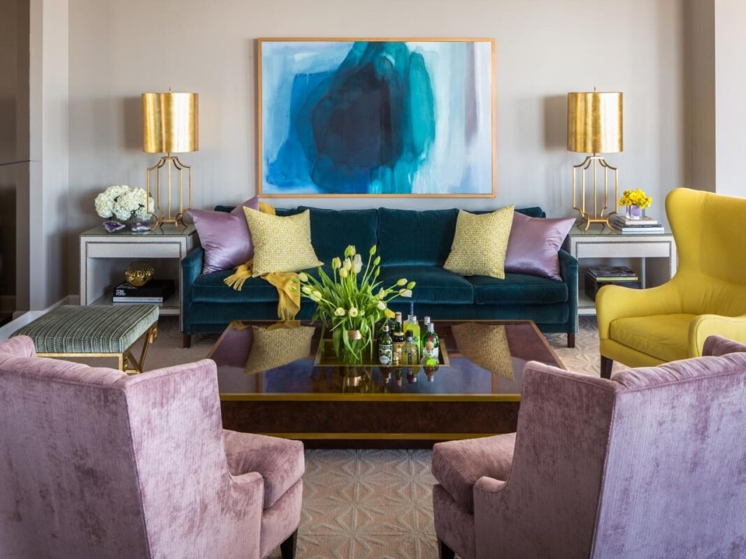
Understanding Interior Decorating Styles
Every interior decorating style comes with its own distinct color palette. From modern minimalism to classic elegance, the choices can vary significantly. For instance, modern designs often embrace neutral tones, while bohemian styles lean toward vibrant, eclectic hues.
Your color selection not only defines the aesthetic of your home but also mirrors your personal style. Soft pastels can create a calm, serene environment, while bright colors can energize and invigorate a space. By familiarizing yourself with various interior decorating styles, you can select colors that resonate with you and achieve the desired mood for your home. Whether you’re going for a cozy cottage look or a sleek contemporary vibe, your color choices are key to the overall ambiance.
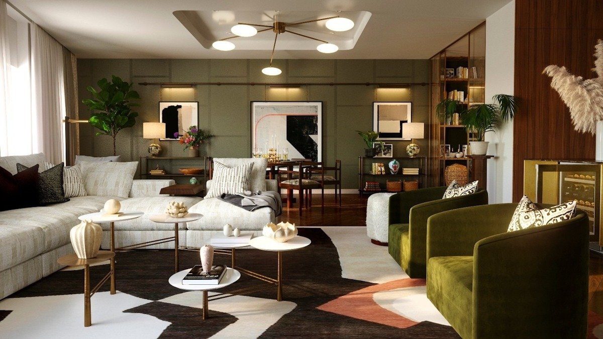
The Role of the Color Wheel in Interior Design
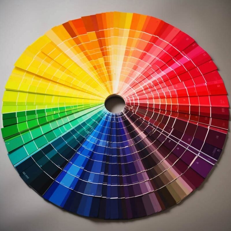
The interior color wheel is a powerful tool that helps you understand how colors interact and complement one another. This visual guide arranges primary, secondary, and tertiary colors in a circular format, simplifying the process of finding harmonious color combinations.
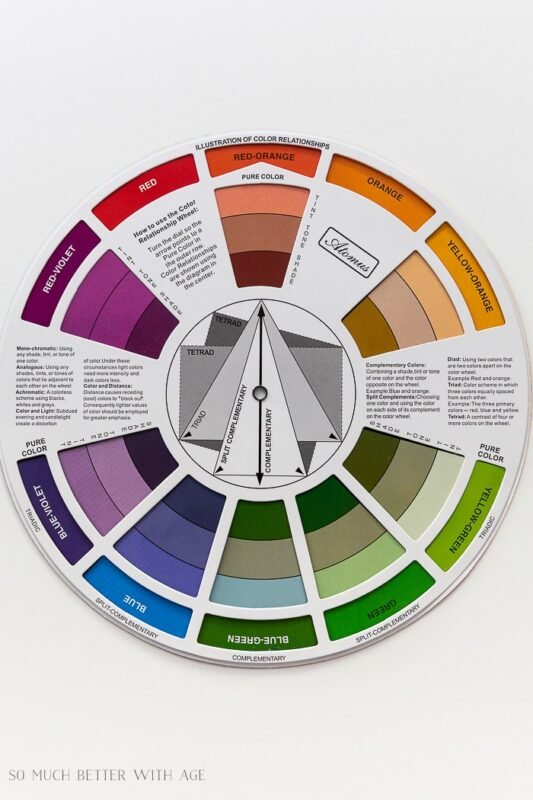
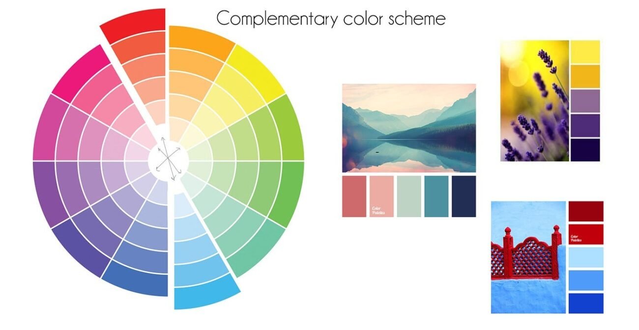
By using the color wheel, you can easily explore different schemes such as complementary (opposite colors), analogous (colors next to each other), and triadic (three evenly spaced colors). Understanding these combinations allows you to create balanced, visually appealing spaces. With this knowledge, you can confidently choose colors that enhance your home’s overall design.
How to Use the Interior Color Wheel
Here’s a simple guide to effectively using the interior color wheel:
- Identify Your Primary Color: Choose a dominant color for your design. The color wheel is made up of 12 hues, each with its own emotional impact and tone.
- Find Complementary Colors: Use the wheel to find complementary colors. These are colors that sit opposite each other on the wheel and create a striking contrast when paired. For example, blue and orange are complementary and can bring boldness and vibrancy to your space.
- Explore Other Schemes: You can also use analogous colors (next to each other on the wheel) for a more harmonious and subtle look or opt for a triadic color scheme for a balanced and dynamic effect.
Popular Color Theories in Interior Design
- Complementary Color Theory: Focuses on two opposite colors on the wheel to create a dynamic, high-energy vibe.
- Analogous Color Theory: Selects colors that are adjacent on the wheel, creating a harmonious and serene space.
- Triadic Color Theory: Involves using three evenly spaced colors on the wheel for a balanced, vibrant design.
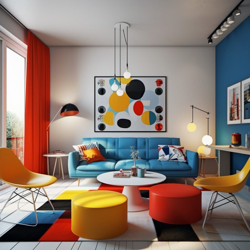
Selecting Colors for Different Spaces
When choosing colors for different rooms, the function of the space should guide your decisions:
- Living Rooms and Bedrooms: Opt for warm, inviting hues like soft beige or light gray. In bedrooms, calming colors such as pale blues and muted greens promote relaxation.
- Kitchens and Bathrooms: In kitchens, use brighter shades like yellow or orange to stimulate energy. Bathrooms benefit from cool colors like light blues and whites for a fresh, clean feel.
How to Create a Balanced Color Palette
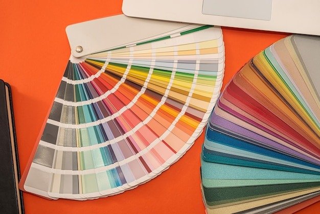
Building a cohesive color palette is crucial for successful interior design. Start by selecting a primary color and then choose complementary shades. You can follow the 60-30-10 rule: 60% of the space should be dominated by a primary color, 30% by a secondary color, and 10% by accent hues. This ensures a balanced, visually appealing design.
Common Mistakes to Avoid
To avoid overwhelming your space or creating color clashes:
- Stick to a defined color palette.
- Balance bold colors with neutral tones.
- Test colors in your room’s lighting to ensure they look the way you envision.

By using the interior color wheel and following these guidelines, you can create a beautifully designed space that reflects your personal style while maintaining harmony and balance.
